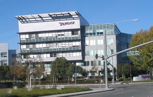
If you are an early day internet user, you could recall and remember the early 90s when everyone owned a Yahoo ID and seemed lost forever in the Yahoo Messenger Chat Rooms! Yahoo! has come a long way from being just a personal internet interest to a compelling internet commerce company. I am sure the founders, Jerry Yang and David Filo, must have never guessed the meteoric rise of their search engine as one of the most popularly visited websites across the globe.
The Founders
 Wondering who are these guys? Jerry Yang and David Filo were two electrical engineering students at Stanford University who had started Yahoo! One fine day during January 1994, they came up with a website called “Jerry and David’s Guide to the World Wide Web” to keep track of their own online interests. Of course the students were proud about themselves. The site was created to serve as a directory of other websites that were organized in a hierarchy instead of being listed as a searchable index of pages.
An exclamation(!) that changed it all
The founders thought the name “Jerry and David’s Guide to the World Wide Web” was too long to recall and during March 1994, renamed their website to “Yahoo”. This was done after the site spread beyond the boundaries of Stanford University. “YAHOO” is a specially constructed acronym that fit as “Yet Another Hierarchically Organized Oracle”. During the start of 1994, they set out to create a new name for their website. Yang and Fing decided they wanted a name that could be tuned into a phrase or acronym to have a recall value among the users . One of the favourite phrases which they considered was ‘Yet Another Compiler Compiler (YACC)’. This prompted them to come up with something similar,”Yet Another Hierarchically Organized Oracle”, that we know as ‘YAHOO’. They instantly checked the Webster’s dictionary for the meaning of Yahoo. Yahoo meant rude, unsophisticated, loud and uncouth. Personally, Yang was said to use foul language in his conversation and Filo was known for his blunt way of talking. With their tastes of personalities, they conceived that the word ‘Yahoo’ as the perfect brand name for their company. However, there was one glitch. The word ‘Yahoo’ was already trademarked by a company producing barbecue sauce and kitchen knives. The founders added an exclamation mark to Yahoo and call for a unique art-work to present the brand name different, so as it carries distinctiveness. The domain name www.yahoo.com was registered on 18th January, 1995 and soon on August 1995, Yahoo website that came with the news from Reuters was launched. They were soon greeted by their first one-million-hits day, which translated as approximately 100,000 users.
Shaping the brand identity of Yahoo!
Initially the brand was presented in a simple black text with the all-time-favourite ‘Times New Roman’ font. It was now time to give a distinctive identity to Yahoo! During 1995, the assignment was passed on to a known advertising company called the ‘Organic Inc.’ from San Francisco. Kevin Farnham was the chief designer at Organic. They came up with something funky. The design of Yahoo! logo included a blue circle that stood for the Earth and a yellow Y-shaped figure with a purple shadow that appears to jump out of earth. The design was created by David Shen along with Kevin Farnham. This lively image was called as the ‘Jumping Y Guy’.
Yahoo brand’s 1st appearance & initial artistic presentation
The Designers:
Then in 1996, they came up with a new logo that used fun fonts to present the brand name. It was brown in color with orange highlights.
Survival from the Bubble Burst
Yahoo! was one of the few lucky web based companies that could survive the dot-com bubble burst happened in late 1990s and early 2000s. Hundreds of internet companies from Silicon Valley were crashed down without generating enough revenues to survive in the fastest business road of internet. Yahoo! continued to expand its business and started acquiring new search engines. They acquired the search engine Inktomi Corporation and AltaVista from California, making Yahoo one of the largest search engines on the web.
Favicon of Yahoo websites
 Favicon is an icon associated with a particular website, displayed in the address bar of a browser once you reach the site. In 1997, Yahoo! came up with a favicon that was made of ‘Y’ followed by their standard exclamation mark.
Yahoo goes all-purple
Yahoo went all-purple with it’s new design that is matching with the existing favicon in 2009. This was the first widely spread, well-accepted Yahoo! logo. With this logo Yahoo went all out in establishing wide range of products such as Yahoo News, Yahoo Answers, Yahoo Finance, Yahoo Mail, Yahoo Groups, Yahoo Messenger, Yahoo 360°, Yahoo Photos, Tumblr, Flicker, Delicious, Yahoo Buzz, Yahoo Maps, MyBlogLog, Yahoo Sports, Yahoo Weather, Yahoo Music, Yahoo Movies, Yahoo Games… In 2008, Yahoo launched Yahoo! Shine, a site dedicated to women between 25 and 55.
2013: Re-defining the design concept of the brand…
 On September 28, 2009, Yahoo Inc. launched its first-ever global marketing campaign, with the slogan “It’s Y!ou.” Yahoo stated that that the campaign was based on the fact that Yahoo was personally important to each user, and enabled the user to personalize the web as per own needs. This mega campaign had run for 15 months with a cost of US$ 100 million.
<Click to expand
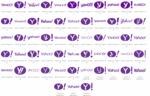
It was in 2013, Yahoo! revamped its site and came up with more interesting features on it’s website and gone ahead with a multi-pronged program to launch it’s new logo. As a part of launching the new logo, Yahoo decided to do something different. Yahoo portal had presented 30 different designs for Yahoo logo, one on each day, from August 7th to September 4th 2013. The final logo was launched on 5thSeptember 2013
The new logo had Yahoo! written in all caps filled with a bright and cheerful purple color. The logo came with a new favicon, which has a Capital Y in the centre of a purple ball along with a large exclamation mark next to it.
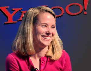 According to Marissa Mayr, CEO of Yahoo, about theie logo, they never wanted to place all the alphabets in a straight line because the human body has no straight lines. Thus, to add a human touch, each letter in the logo has a slight curve. Each letter has a thicker and thinner stroke, that is subjective of the nature of work at Yahoo. The style consists of a typeface called Optima. In order to preserve the iconic Yahoo model, they made some playful changes to the OO’s of YAHOO. The shadows and the extruded line running down the middle of each character helped add depth to the logo. Finally, the letters are all upper-case, as it made the brand name easily readable.
Future still appeals Yahoo
Yahoo! continues to venture into new and upcoming areas on internet. Yahoo! has crossed over 800 million monthly active user-base globally. It is one of the most trafficked internet sites across the world and continues to increase features, tools and solutions for its users.
Yahoo! has come a long way from a simple web directory to a commercialized and optimized social, internet portal and expect to explore beyond all boundaries.
All Intellectual Properties referred on this website are absolutely owned by their respective owners.


