KFC is definitely finger lickin’ good stuff for the foodies. This can be asserted by the number of KFC outlets around the globe. The chicken has been in food fashion since 1930.
Let’s clock back the time to know more about the story behind the KFC logo. No wonder if you didn’t know who the man was on the KFC logo. It is the founder of the greatest food chain called KFC. Now lets know the man behind this prominent brand better!
All about the messy legend: 1930 – 1952
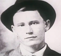
Harry Sanders, the man who created KFC was born in Henryville, Indiana and was named as ‘Harland Sanders’. The first word he probably spoke was ‘chicken’, but there is no proof for this. He was about 6 when his father passed away and that forced his mother to become the breadwinner for the family. As the eldest son of the family, he had to take care of his sibling when his mother went out to work. His mother taught him to cook as he had to take care of his younger sibling at home. This experience from mumma’s kitchen made him a master of many Southern American dishes.
The fried chicken took birth:
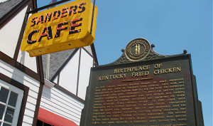
As he grew up to be a lad of 13, he left home in search of success. He took up various jobs and finally by the year 1930, saved enough to buy a Shell fuel-filling station on US Route 25. This route was just outside North Corbin, Kentucky. At the fuel-station, for the first time, he served his delicious chicken recipes that he had learned at home while growing up. The fried chicken, steaks and country ham tickled the taste buds of his customers. Business grew, so much that he could manage to buy a larger fuel-filling station on the other side of the road. His popularity kept growing for the taste and the service rendered at his fried chicken outlet. In 1936, Governor Ruby Laffoon, gave an honorary title of ‘Kentucky Colonel’ to Sanders.
1937 was the year when he further expanded his restaurant to 142 seats from the mere 6 tables. Sanders, even went on to add motel across the street to his restaurant business. He called this the “Sanders Café”.
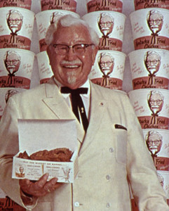
By the year 1940, Sanders formulated his ‘original fried chicken recipe’. He never came public with his recipe, but it is often rumored to contain much more than just salt and pepper. In the year 1950, Sanders began to dress up like a Colonel, the name he earned as an honorary title. Soon, he began calling himself as ‘Colonel’. His friends went along with his pretend-play, but gradually began addressing him as ‘Colonel’ earnestly.
Sanders sold his properties and began travelling all over the US to earn franchises for his chicken recipes. In 1952, he franchised his brand to his dear old friend Pete Harman of South Salt Lake, Utah. A sign painter called Don Anderson was hired by Harman. Anderson was the man who first coined the name ‘Kentucky Fried Chicken’ aka ‘KFC’.
The word ‘Kentucky’ gave Harman an edge over the competition. It evoked a more exotic feel when savoring the chicken. Also, the word became associated an image of Southern America’s hospitality in the customer’s mind. Soon, the term, ‘It’s finger lickin’ good’, was trademarked by Harman.
1952:
The KFC logo design had Colonel Sanders himself in his white coat and black bow tie. The text books having the rules for designing logos, do not encourage the use of a human face. However, the rule was overtaken in this brand as it turned out to be one of the most well-known and easily recognizable logos of all time.
The logo in 1952 had ‘Kentucky Fried Chicken’ written in a fancy fashion in black with the face of Sanders in his indigenous-style and black bow tie placed right at the end of the company name.
1978:
The logo underwent changes with the use of a different typeface for the trademark that appeared larger than before. The colonel’s smiling face was now placed next to the words written on the left.
1991:
During the 90s, the world was waking up to healthy eating habits and the word ‘fried’ in the name sounded quite, um, fattening. In order to appear more healthy and not just a mere tasty, junk food, the company decided to change its name. They adopted the name ‘KFC’ as the intitals were already a well-known trademark worldwide.
1997:
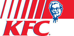
The logo again underwent a huge big change in 1997. It had the colonel sporting in his white coat with black bow tie and smiling more pleasantly than before. The face was placed on a red background and ‘KFC’ written in a smaller typeface at the bottom right hand corner.
2007 – Current:
The new logo introduced in 2007, in which the colonel had changed his attire. He now wore a red apron with the red background shaped like the ‘KFC Bucket’. You would now even sight a tagline “sogood” along with the KFC logo.
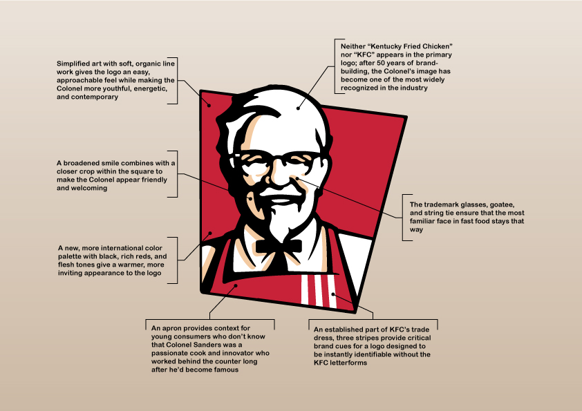
Do you want to know more about the KFC man still living as a legend in the logo? Here is a graphic presentation to get more acquainted with the intricacies and meaning of the logo sketch:
Know more KFC facts:
- The making of this delicious fried chicken uses 11 secrect spices and hearbs and was invented during 1940.
- The slogan ‘It’s finger lickin’ good’ was invented during 1950’s by Ken Harbough, KFC manager, and it is still used after more than 50 years.
- The slogan ‘finger-licking good’ when translated into Mandarin (Chinese), sounded like ‘eat your fingers!’. It doesn’t sound tasty, right!
- It was during 1952, that the first bucket of KFC was sold.
- KFC brand is sold in more than 18,000 restaurants in above 110 countries across the world .
- One set of white suit, bow tie black clip of Sanders were sold during an auction on 2013, June 22. Can you guess the price? It was $21,510.
- Indo-American Muktesh Pant, an ex-IITian, currently holds the position of the CEO of KFC.
KFC Logo timeline:
KFC is the perfect example showcasing a unique concept that worked as the company’s logo. Who would have imagined the creators face can be turned into not just a logo, but one of the most successful logo designs. The colonel’s face helps the customers connect with the brand instantly. It’s time for me to dig into my bucket of chicken. Ain’t it more than just ‘finger lickin’ good’?
All Intellectual Properties referred on this website are absolutely owned by their respective owners.

