Summer is round the corner! The cold fresh-lime-soda isn’t really cold enough! When I was flipping the list of options to spend the summer this year, Australia came into my mind. Just like any other budget being, I tried booking tickets few months early. But Qantas grabbed my attention for its huge branding of Australia. “There’s nothing like Australia…” the latest consumer campaign by Tourism Australia says, when it comes to explaining this mesmerizing continent. The 65% population flies in and out of the country, in the flag carrier airline of Australia – Qantas. And, here I dig into another great brand’s history!
Story behind the history of Qantas:
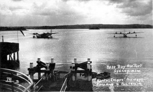
Qantas Seaplanes
Qantas, the national airline of Australia was founded in Winton, Queensland on 16th November 1920. It was incorporated as ‘Queensland and Northern Territory Aerial Services Limited’. Today, we are more familiar with its acronym ‘Qantas’. In other words, the brand-name “QANTAS” is derived as an acronym for “Queensland and Northern Territory Aerial Services”. The first international flight with Qantas was commissioned way back in 1935, from Darwin, Northern Territory to Singapore. It is also been nicknamed as “flying kangaroo”. Another interesting thing about the airline is, it ranks as second oldest airline in the world. Owning 65% share in the domestic market is a bliss to a firm like Qantas.
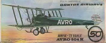
Avro 504K
Avro 504K is the first aircraft launched by the Qantas airlines. Originally, this airplane plays the role of a bomber, fighter and trainer. At the very beginning, the aircrafts of Avro 504K were sold to Royal Naval Air Service(RNAS) and Royal Flying Corps(RFC). Later, in the history of flying the passenger flights, Qantas also owned Airbus A380, the biggest passenger jet aircraft in the world.
The great history of Qantas logo:
The logo of Qantas, has been changed from its original logo many a times. The ‘kangaroo’ symbol has become the synonym of home to all the Australians. Let me fly you through the history of Qantas logo and design.
1944 -1947:
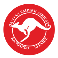
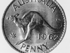
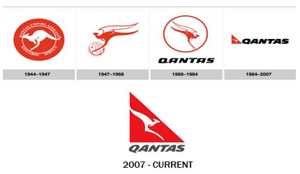
The first and original symbol of Qantas aircraft was crafted from the Australian coin of one Penny. The great grandfathers might still preserve such penny as a memento. It had a Kangaroo, which was used by the Trans Australia Airline(TAA). TAA, renamed as Australian Airlines, was one of the two major domestic airlines in Australia from its inception in 1946 and till it was sold to Qantas in 1992. And, then the entire airline was re-branded as “Qantas” in 1993. Then on, the “kangaroo” became the integral part of its emblem. The kangaroo was illustrated for the first time, just below the cockpit of the first Liberator aircraft G-AGKT of Qantas. Soon, the Kangaroo symbol featured on all their flights. The firm renamed its Indian Ocean passage service to “Kangaroo Service”.
1947 – 1968:
The second logo, which became a legend, was designed by the German-Australian architect and graphic designer, Gert Sellheim. In the year 1947, to celebrate the debut of the aircraft ‘Lockheed L749 Constellations’, the new logo was introduced. The design had a winged Kangaroo with the globe at its feet to describe that their planes travelling across the globe. The aircraft operated in the UK services and was the first to fly through London with Qantas crews.
1968 – 1984:
A redesign was felt necessary. The logo was slightly changed with the flying kangaroo was depicted within a circle. The globe at its feet was removed.
1984 – 2007:
The company unveiled a new, modified logo designed by Tony Lunn of the Lunn Design Group, Sydney, in June 1984. The Flying Kangaroo lost its wings in the new logo and was made to look more slender and stylized. Instead of the circle, the Kangaroo was placed in a triangle that looked like the wing of the airplane.
1995:
Here is a special mention of the slight tweak in the logo that was carried out to mark the 75th anniversary of the Qantas jet aircraft, in the year 1995. The symbol had the flying Kangaroo along with the words “75 Years” to show the significant contribution of Qantas airlines to civil aviation.
2007 – Till Date:
The current logo used by Qantas Airlines was designed by Hans Hulsbosch of Hulsbosch Communications, Australia’s leading corporate brand design agency. This was introduced to the world in 2007. The designer felt, through 94 years, the airlines has offered a lot to its consumers, and this new logo is tracing back to its origin can make them feel nostalgic. In the new logo, the kangaroo appeared more contemporary and modern. It helped in interpretation of its iconic logo in line with the new generation of aircraft introduced by the company. The feet of the kangaroo in the logo appear to be off the ground. The tail seems to point upwards more than it did before. The font used for ‘Qantas’ appear more playful, unique and fun.
Qantas logos’ timeline:
Through the decades of continuous flying, Qantas airline logo with its flying kangaroo has emerged as a distinctive and recognizable brand and logo around the world. The present logo of the red tail and white kangaroo make it one of the most memorable logos across the aviation industry too.
This is how the flying Kangaroo grew up so big all through these years.
Hey, at the end of the ‘kangaroo story’, are you set to hop with the kangaroos of Australia?
All Intellectual Properties referred on this website are absolutely owned by their respective owners.

