
When the Bayerische Motoren Werke (pronounced as Bavarian Motor Works in English) logo passes by, the thought about a much-talked topic raises up. The sky blue color with white quarters in it signifies two vital aspects, mentioned the Executive Board Member of BMW, Dr. Florian Triebel. One being the fast rotating propeller and the other related to Bavaria, the region where the BMW products are manufactured. Lets decipher everything about this amazing logo and astounding brand!
Checkout what the symbol has to speak, the symbol of ‘Sheer driving pleasure’ from the video here:
With the only ambition to reach the customers expectation, BMW has won the heart of many driving lovers. Not just comfort and luxury, it has run in parallel with the expectations of the new generations with time!
The search for the roots of the birth of the logo still continued. In the archive of BMW group, numerous documents, testimonies of prodigious history, photographs of about 9 decades old, about the firm are stored in here. When they identified the first document with a BMW logo on it, it seemed to be 5 years older than the time when R-32 was launched. This was during 1918. This is the first time when a BMW logo appeared on a printed publication. The history began with aircraft engines and then motor bikes, and finally cars! To remember, BMW had a prominent role in the World War II as a maker of aircraft engines for the German military.
RAPP into BMW
When RAPP grew into BMW, the firm wanted all the aspects, company identity, , business segments based on the RAPP’s logo. The logo of RAPP has a symbol of black horse on it. BMW ironically has the Bavarian national colors as its symbol. To create a blend of BMW and RAPP, the letters B, M and W are crafted exactly as RAPP on its logo.
The origin of the trademark
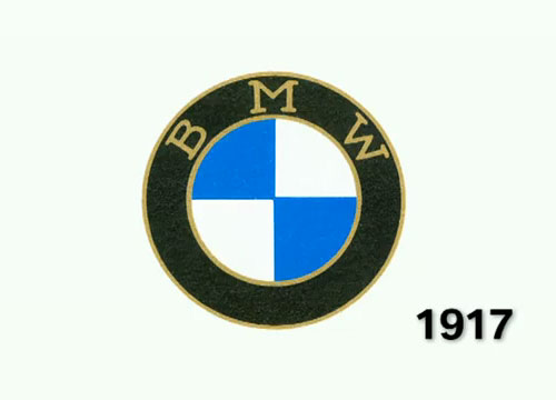
The story of origin of this trademark has a fancy story to recite! The world appreciated German automobile firm is head quarter at Munich, Bavaria founded during 1917. This organization not only manufactures automobiles, but also engines and motors. The firm is indebted to the roots from where they have developed. It acts as a crucial success reason behind the prodigious automobile giant.
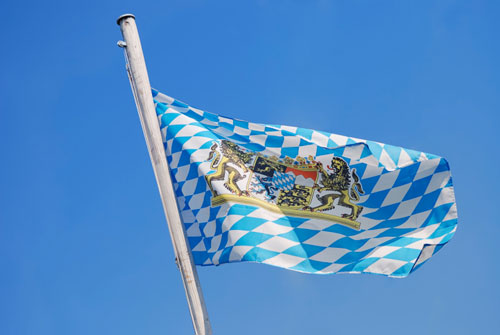
The logo holds the two colors of Bavaria flag and also the white plus blue tints encircled on it, depicting a white propeller rotating in the blue clear sky. This propeller is a reminiscent of the firm’s origins. Did you know that during World War 1, BMW used to manufacture military airplanes? It is of course a corporate identity that showcases memories of power.
BMW aircraft engines
The company at first used to manufacture aircraft engines. This is the sole reason for depicting the blue and white. The stylish display of an airplane propeller that is rotating, facing the blue sky took his breath away.

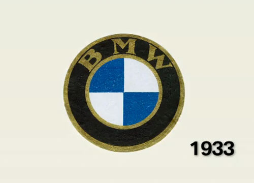
The viewer also witnessed the letters B, M, W, on the propeller that gave parturition to this logo design. The first vehicle, Dixi took the pride to embrace the BMW logo on it during 1929. It also introduced its first motorbike, R-32 with the BMW logo on it during 1923. This logo is out into the world for the first time. This is when the success run of the logo to win the world has just begun! The success run began. Though the motif has undergone many renovations over the long years, the imaginative traits and sophistication of the original logo is retained.
The fast shiny and rotating propeller:
The BMW logo evolved from the fast rotating propeller of the aircraft. The checker boxes with blue and white shades are supposed to be the blades rotating facing the sky. It is more enticing to know that the logo has a history back in World War I where planes colored white and blue were hovered by Bavarian Luftwaffe.
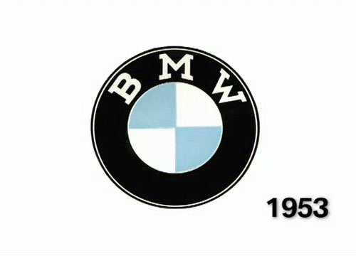
The font style and the size is Helvetica typeface designed by Max Miedinger and Eduard Hoffmann during 1957. The three vibrant colors used in the logo are black, blue and white. The black color in the motif signifies excellence and elegance in the designs of the cars that is being manufactured by BMW. The white signifies charm and purity. Finally the blue depicts the reliability and strength of the firm.
Though the heated discussions remain, if the logo has to signify the country or the rotating propeller, the brand is highly sophisticated and exemplifies luxury. The story continues with the verdict that the aircraft engine manufacturer logo eventually converted into BMW logo. This motif is considered as one of the finest logos in the brand of cars. It has always been a symbol of a unique driving pleasure.
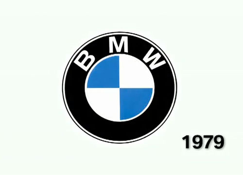
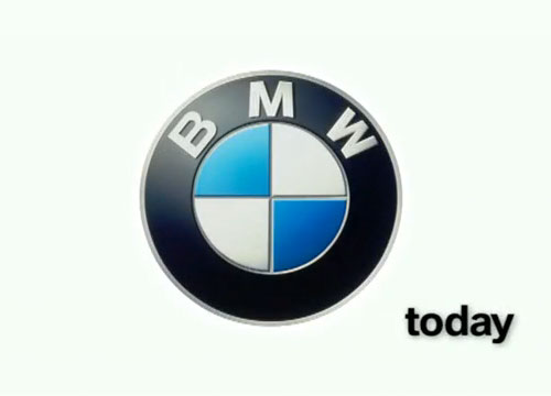
The logo had undergone another change in its design during 2000. One change is embossing the roundel and the other obvious change is resurgence of the sea green color on it. These colors are polished in matt to display a soft touch to its viewers. This version of the logo is the final corporate identity of the firm, representing the core business throughout the world.
![]()
The logo is quite unique in its design and use of colors. The identity it has offered to its firm depicts its ‘one of a kind’ character. Irrespective of the various stories that has sprouted about the logo, like few focused on the colors of the motif, few on the rotating propellers, few on the rounded shape, or either the flag of Bavaria. All these theories have added a spice of ‘curiosity’ to the fans of BMW, the world renowned automobile company.
All Intellectual Properties referred on this website are absolutely owned by their respective owners.