
What would have happened if the red yummy apple didn’t fall on Isaac Newton’s head? Well, keeping the technology aspects on one side, will the logo of the Apple Inc. might have been something else?! It is difficult to interpret what runs in Steve Jobs mind.
The legends of the legendary Apple logo:
The third co-founder of Apple Inc. designed the first logo of the firm during 1976. It depicted Isaac Newton and the legendary apple dangling above his head. On the borders of the logo, the text says “Newton… A Mind Forever Voyaging Through Strange Seas of Thought … Alone”
The story of Apple logo is unique and enticing. One fine day when Steve Jobs invented the name Apple for his firm, Steve Wozniak, the person who is part of Apple computers creation laughed at Jobs and said ‘It’s a computer company, not a fruit store.’ Wozniak might have not thought what the single apple can do!
Another fine day, Jobs wanted something new, something that sounded different for the logo. He then hired the designer, Rob Janoff expecting an extraordinary from him. Rob has never even dreamt, even in his wild dreams that the logo he designed would move the world. Then the rainbow logo took birth.
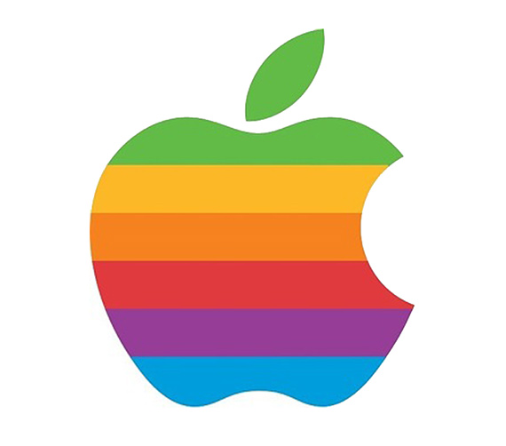
It lasted from 1976 to 1998. Considering the rainbow like colorful stripes on the motif, Jobs insisted on having those stripes to depict how ‘humanized’ the firm is. Rob Janoff mentioned that there was no particular reason on using specific colors in the logo. Just that, the leaf part of the logo is colored green to represent a leaf. This flamboyant logo lasted for almost twenty two years till Steve Jobs wanted another ‘change’ in 1997 when he returned back to Apple.
 There was time when the ‘apple logo was found to be very expensive’. Yes. It was very difficult to print the colorful logo on the equipment’s using the four color print technique. It used to consume lot of time, effort and money. Though Janoff suggested the use of black line to separate the colors, Steve rejected the idea of displaying lines and used the tough technique of printing. Michael M. Scott from Apple Inc. called this logo ‘the most expensive bloody logo’. Yes, just the print priced so much!
The firm was bleeding with money from every window. This is the right time to leverage more advantage, to make the motif more prominent and recognized universally. Then why not showcase it where people can see it? Thought Steve Jobs and his Co. They even interpreted that the cause of low sales of the Apple Computers II can be the colorful childlike logo too. Just an iota logo mattered in huge establishment sales? It did, prodigiously!
 The rainbow motif on the electronics and computers looked funny, childlike. Imagine an iMac with a rainbow apple logo. Of course you will start wondering in a while if the iMac is yours or of your kids.
The stylish apple logo is born. The colors are replaced with more stylish monochromatic appearance. The shape and size of the motif remains the same. What better logo can be created for Apple Inc. other than the appreciated and dominant Apple logo? It is used everywhere now, the iPod’s, computers, iPad’s, iMacs and what not. Apple today, is not just a logo of Apple Inc. It is a ‘Brand’ that is admired, fascinated and loved by people around the world.

< Click to enlarge
The funny, aspiring and intelligent interpretations of the bite!
For many long years, the rumors about the Apple logo with the motif of a bite on the apple depicted various interpretations to people around. Few even analyzed the logo as a tribute to Alan Turing, the computer scientist and the revolutionary mathematician, who had committed suicide by eating an Apple injected with cyanide during 1954.
 When Rob Janoff heard these rumors, he laughed saying “What a wonderful urban legend.” Few even said that, Steve Jobs worked in an Apple farm during 1975 and thus the name Apple. Bill Kelley who is part of Regis McKenna Advertising remembered the history of bite on the apple differently. He mentioned that, the bite is a symbolic representation of acquiring knowledge. Remember, ‘eating the apple of the tree of the knowledge’? goes back to Adam and Eve.
The real bite!
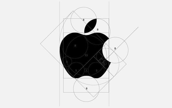
Well, to seriously halt the mind to interpret more on what the bite can be, here is the actual reason. Rob designed the bite as he felt; it would help him in depicting the logo as an apple but not a cherry or a tomato. What? Really? Yes.


While he was designing the apple, Rob felt something’s missing. It looked complete only after the ‘ Bite’. Moreover, the sound of bite played well with the computer geeks as it sounded familiar to ‘ byte’, the aspect related to telecommunications and digital information. Well, now Tim Cook, the new CEO shall change the apple to anything else? Frankly, no body messes with Steve Jobs’s “apple”.
Apple Corps Ltd. formed by The Beatles in 1967 and Apple Inc. by Steve Jobs began in 1976 had come in face to face with a series of lawsuits. The reason is that, Steve Jobs used a similar logo and brand name for his then new firm Apple Inc. The case ended when Apple Inc. paid a huge settling to Apple Corps Ltd. When asked Jobs, on why choosing only ‘apple’ for his firm he said,
“I like apples and love to eat them. But the main idea behind the apple was to bring simplicity to the people, in the most sophisticated way and that was it, nothing else.” Wow, what a vision for the next-generation technology requirements. He awed every Apple owner!
Besides all brand stories and history, Apple stands 1st as the World’s Most Valuable Brand with a brand value of $ 145.3 billions as per the 2015 ranking; report by Forbes.
All Intellectual Properties referred on this website are absolutely owned by their respective owners.