
International Business Machines Corporation, better known as IBM, is the American multinational technology and consulting corporation and has a very famous logo. The logo is written in blue with 8 crossbars making up the name IBM. There is a hidden meaning behind IBM logo and we shall learn more about it as we go through its journey in the history.
1888-1911:
IBM was not born as IBM. There were many predecessor companies that used a series of logos before the advent of IBM.
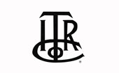
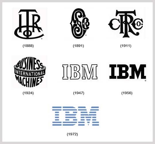
It all began in 1889, with the International Time Recording Company (ITR). The company produced mechanical time recorders that were patented by Willard L. Bundy in 1888. In 1911, the company got merged with another enterprise called Computing-Tabulating-Recording Company.
1891 – 1911:
Edward Canby and Orange O. Ozias were two businessmen from Dayton, Ohio. These brilliant entrepreneurs purchased the patent for the newly invented computing scales in 1891. Thus, incorporating the Computing Scale Company to produce commercial scales.
1911 – 1924:
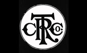
The three companies, International Time Recording Company and the Computing Scale Company as well as the Tabulating Machine Company were merged together in the year 1911. Charle R. Flint, who was a financier, had directed this merger and formed Computing-Tabulating-Recording Company (CTR). The famous motto of the company “Think” was the brainchild of Thomas J. Watson, the then General Manager of CTR, who placed a lot of emphasis on research and engineering.
1924 – 1946:
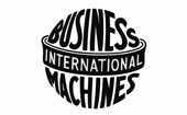
The Computing-Tabulating-Recording Company(CTR) adopted the name International Business Machines Corporation in 1924. The rococo styled letters that formed “CTR” were replaced by the words “Business Machine”. It was written in the shape of a globe. These words were horizontally surrounded by the word “International”in the center. However, this logo did not get connected with the consumers too well. It had a cold, bureaucratic image rather than a friendly, approachable image. So, the company had decided to create a more user-friendly image.
1947 – 1956:
Introduced in 1947, IBM, the abbreviation for International Business Machines, soon became an international brand and to carry forward its reputation, from punch card tabulation to computers, they reinvented the new logo. It was also to gather a more friendly image for the company. The new logo was first introduced on the masthead issue of Business Machines on 1st January 1947. The globe was replaced with IBM written in Benton Bold typeface.
1956 – 1972:

In May 1956, Tom Watson Jr. took over as the position of Chief Executive of IBM from his father Thomas J. Watson Sr.. The move called for a subtle change in the logotype of the company. Paul Rand, a noted graphic designer, replaced the Benton Bold with City Medium typography. This gave the logo a grounded, balanced and solid appearance.
1972 – Till Date:
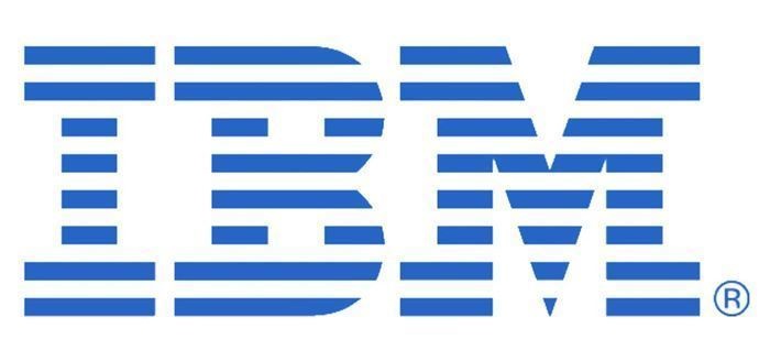
In 1972, the company logo underwent another change. This new logo was again designed by Paul Rand. The solid letters were now written using horizontal stripes. These stripes stood for speed and dynamism. The block letters indicate authority, without alienating the consumers. Also, the logo looks as if it is made by a computer, rather than hand-drawn.
The hidden meaning behind the big blue logo of IBM lies in the white lines passing through the letters. The lines form the equal sign, that represents equality.
The logo-transformation of IBM in a glance:
Marking its 100 year anniversary, Watch the achievements and history of the prodigious global initiative here:
https://www.youtube.com/watch?v=9Mla9cUiXnY
Few interesting facts about IBM:
- During 2008, IBM has collected around 4,186 patents and became the first organization to collect more than four thousand patents in a single year. The patents issues to this firm exceeded the leading inventors namely Apple, Microsoft, Accenture, HP, Oracle and EMC in the year.
- Five employees of IBM have won Nobel prizes in Physics.
- IBM had helped NASA through IBM computers for the first ever human landing on the moon.
- The firm is credited for the invention of ‘the first ever blood cell separator’. This is used for the treatment of leukemia.
- IBM also famously known as ‘Big Blue’. The origin of the nick name is not known yet.
- Since the acquisition of Lotus in 1995, IBM has bought more than 130 firms.
- The first computerized golf scoreboard was invented by IBM, in 1967 (Greater Dallas Open).
- The IBM’s campaign ‘Think’ created by Thomas. J Watson in 2008 had influenced a huge lot of gizmo folks and the computing industry during that time.
- Top 50 banks in the world use IBM mainframes for their computing.
The term ‘Big Blue’ stands for the big share the company holds in the market and blue is the official color of the 8-bar IBM logo. IBM logo is a mark of quality, of trust and the strong commitment of the company to maintain high standards.
Adding more value to it’s brand story, the brand ‘IBM’ stands 5th in the World’s Most Valuable Brands ranking with a brand value of $ 47.9 billions; calculated in November 2014, report by Forbes.
All Intellectual Properties referred on this website are absolutely owned by their respective owners.